Dell Website, redesigning for a better purchase experience
Overview
Dell is a multinational company that develops, sells, and supports computer related products and services. That being said, Dell website has a wide verity of users including IT techs, developers, businesses, office administrators, professional gamers, and of course average users.
Tools
Balsamiq, Adobe Illustrator, InVision, Sketch, Paper
Timeline & Date
1 week, 2018
Problem
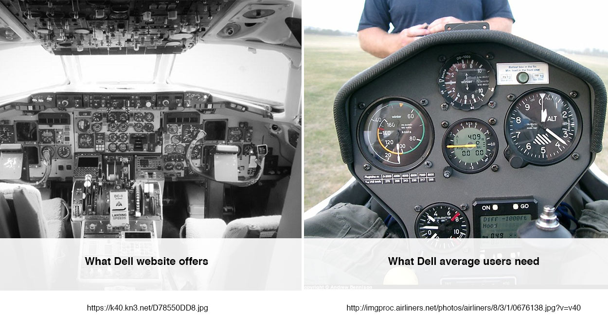
The main percentage of the Dell website visitors are not tech savvy. They visit the website for computer purchases, download software, and post-purchase services. While the Dell website hasn’t properly tailored to meet this audience’s needs. As a result, in using the website they have to deal with different obstacles including inconsistent navigation, technical jargons, a verity of unnecessary options, detailed information, and a high learning curve.
Hypothesis
There should be an easier, faster, and trustable way for Dell average customers to find and buy right laptops.
Process
In this project I used Lean UX technique and was able to complete the following steps:
Research
Synthesis
Design
Prototype
User Test
Research
HEURISTIC ANALYSIS
I used Norman Nielsen usability heuristics to evaluate the Dell website. The following list of issues is the outcome of the evaluation:
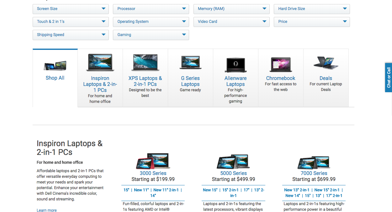
- Dell website offers too many options
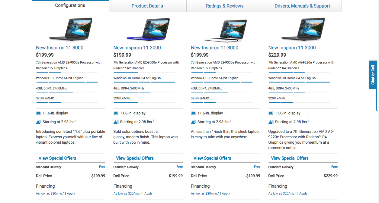
- The product specs sheet contains detailed and extra information
- Usage of technical jargons
- Inconsistent navigation
- A high learning curve for average users
- It's hard for average users to understand the difference between laptops and their applications
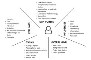
EMPATHY DIAGRAM
To understand users better, find pain points, feeling, influences, and develop a proto-persona I used empathy diagram.
Synthesis
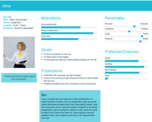
PROTO-PERSONA
What I have achieved through the empathy diagram helped me to develop a proto-persona with the following use scenario.
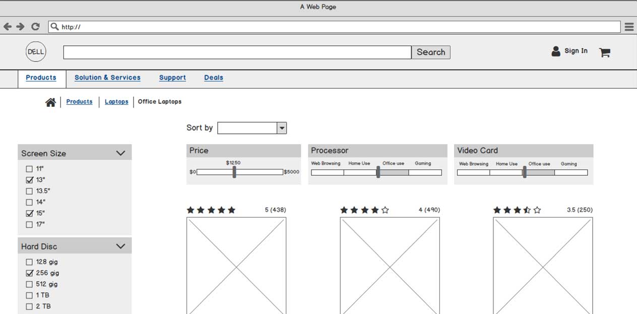
PRIORITIZING KEY FEATURES
Through a research, I came up with a list of key main features that needed to be considered for buying a new laptop. Then I used a quadrant table to prioritize features to main key features, and second main features.
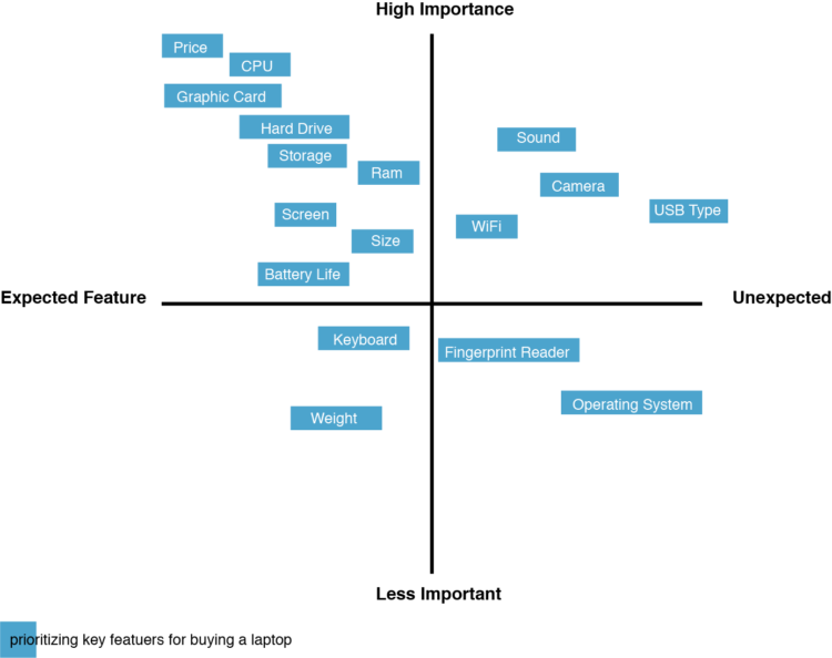
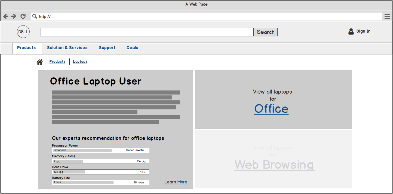
Main features: Price, Processor (CPU), Video Cards (Graphics cards)
Second main features: Ram, Storage, Size, Screen, Weight, Battery Life
Design & Solution
Proto-persona gave me enough insights to come up with a list of suggested solutions, which later I developed the design accordingly:
- A simpler website helps users to save time and navigate better
- The offered options should be limited and clustered appropriately
- The provided products' filters should be understandable and accessible
- The technical terminologies and jargons should be interpreted and understandable for average users
- Educating users through the purchase process and using the website
- Previous customers’ reviews should be visible and accessible
By having the suggested solutions, still there were two main issues that I needed to focus on:
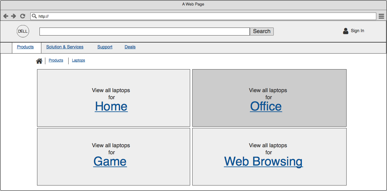
- How to define and translate the definition of laptop usage (Home vs. Office) for average users to make it easily understandable?
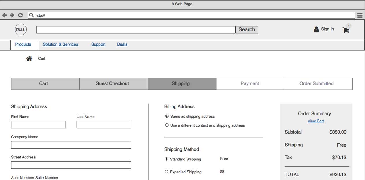
- How to make the purchase process simple, straightforward, and less time-consuming?
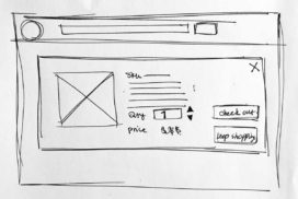
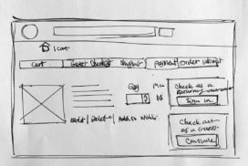
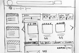
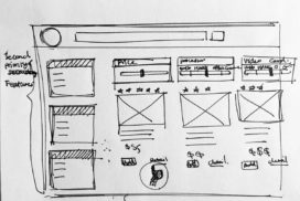
Sketches


Scenario
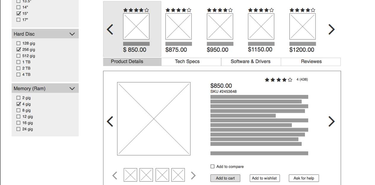
I developed a scenario for Jana to cover the following main features I aimed to include in MVP: selecting an office laptop, learning about the main key features, getting information about the selected laptop, and finalizes the purchase process.
Jana needs to buy a laptop for her son, but she also needs to be able to use it for her regular uses. She doesn't have any computer knowledge but she has been told Office laptop would be a good choice. So she is going to visit Dell website, find an office laptop, and learn about the concept. Then selects a laptop that matches her budget, adds it to her cart, and completes the purchase process.
User Tests
One of the distinctive features of Lean UX approach is running user tests after each step. So, to make sure that I'm following the process and the design meets the user's needs, I ran three user tests after the first prototype. However, I was only able to run three user tests due to the tight deadline (1-week project).
USER TESTING RESULTS
The following listed items are the features that users have difficulty to understand and navigate. So, for the second prototype, I have tried to address these issues.
- Users had a hard time to figure out the grouping computers function.
- The key features filter weren't clear enough.