Automated Librarian a design for a better library experience
Overview
From our experiences and our observations at the University of Texas academic libraries, we recognized an opportunity to create a portal in which to enhance and streamline the user experience of an academic library patron. We envisioned a fully-featured application, tailored specifically to the academic library patron, developed for the Samsung SUR40 multi-touch table with Microsoft PixelSense technology. This application would provide book borrowing, book returning, library database searching, contextual maps, and synchronized note-taking with physical library books.
Tools
Microsoft Word, Visual Studio Blend Sketchflow, Adobe Illustrator, Sketching
Timeline & Date
2 months, 2013
Teams
Emily Lazo, Kelly Liao, Hamed Samadi, Wei Xing
My role
Research, Design the user flow and initial concept, Wireframing, Hi-Fidelity Prototype, Front-end developing for the final product
Process
Research
Target group (users): The University of Texas at Austin students, Perry Castaneda Library(PCL) users
Research method: Survey (30 participants), 5 interviews, observation, and literature review
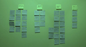
Without existing research for multi-touch tables in public university library spaces, we conducted preliminary research to ascertain the tendencies of library patrons (specifically at University of Texas libraries) as well as the potential shortcomings of the library experience for these individuals. By having the information in hand we proceeded to affinity map to find out our design direction and narrow our focus.
Our initial research also involved a literature review of broader topics concerning engagement with walk-up-and-touch displays, such as the ramifications of its technological nascence. Because the technology is relatively new, interaction with walk-up-and-touch displays is driven by the novelty of the interface. We considered this in our development and were faced with issues due to users’ unfamiliarity with this technology in our testing. There is a certain learning curve that must be surmounted.
Research Synthesis
Browsing process
– Students usually find books information within online website library (the University of Texas at Austin) and then go to libraries to check out the books.
– Finding a book on stacks is hard and time-consuming. Students usually ask for help if they couldn’t find the book they need.
Self check-out
– Students like to go through the check out process by themselves.
– They like to do check out on their own and meticulously as they are busy and don’t have enough time.
– Check out without using ID cards is ideal.
Technology Barriers
– Engagement with walk-up-and-touch displays.
– There is a learning curve when it comes to using the new technology.
Concern & Feeling
– They feel frustrated when the check-out line gets longer.
– Book due date missing is a big concern for students.
– They like to check out without using ID cards as they might forget to have it sometimes.
– They think the check-out could be faster and more efficient.
Persona
Empathy Map
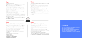
The empathy-mapping process helped us to better understand our users and reveal their feelings, thoughts, and pain points. It also helped us to come up with Maria Garcia persona a first-year Health & Science student at the University of Texas at Austin.
Maria Garcia

Maria is a first-year Health and Science student at the University of Texas at Austin. Reading is one of her favorite hobbies and she enjoys reading fictional and science books. To use the privilege of being a UT student, Maria is going to go to UT Perry Castaneda Library(PCL) to walk through the library and learn about borrowing procedures. She heard that the library started to use a self-checkout system to facilitate and expedite the process. That said, she is going to borrow the Harry Potter latest book through the new checkout machine.
Goals
- Learn how to search and locate a book.
- Learn how the check out process works.
- Accomplish her goal and check out a book.
Frustrations
- She is not familiar with UT library system and doesn’t know how to find and locate a book.
- She doesn’t know how the check out process works.
- She hasn’t used Microsoft Surface before.
- Checking out books without UT EID Card is impossible.
Design
Initial Sketches
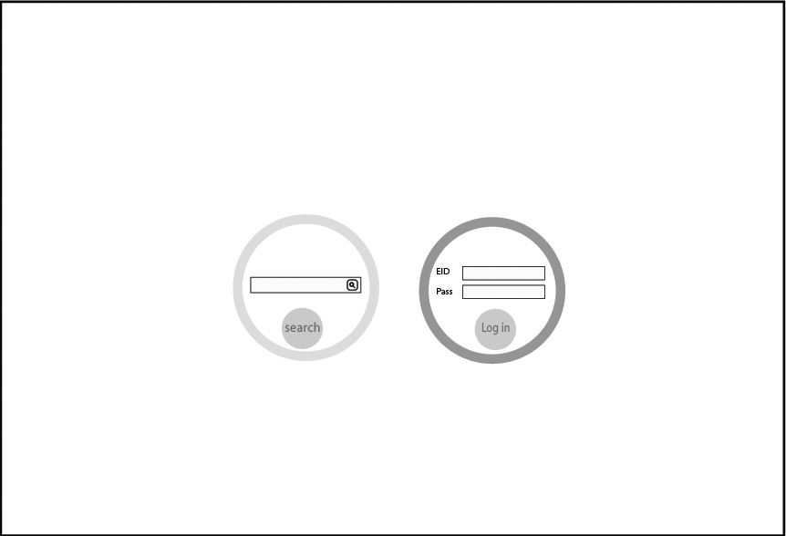
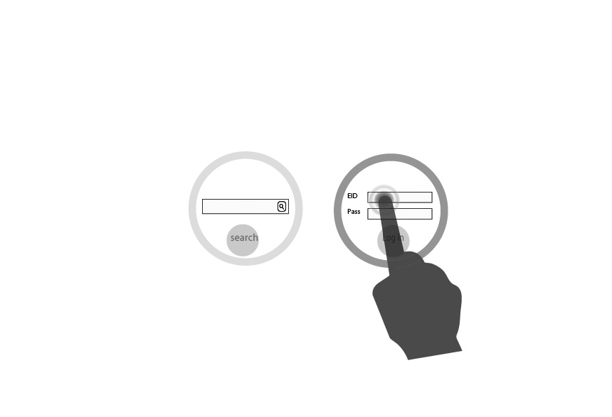
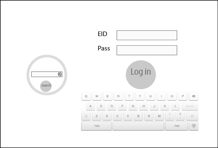
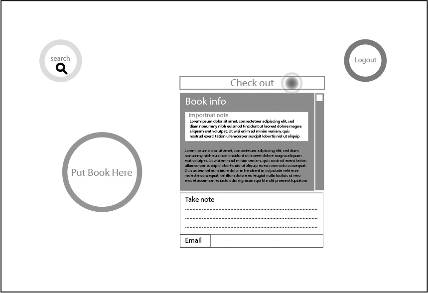
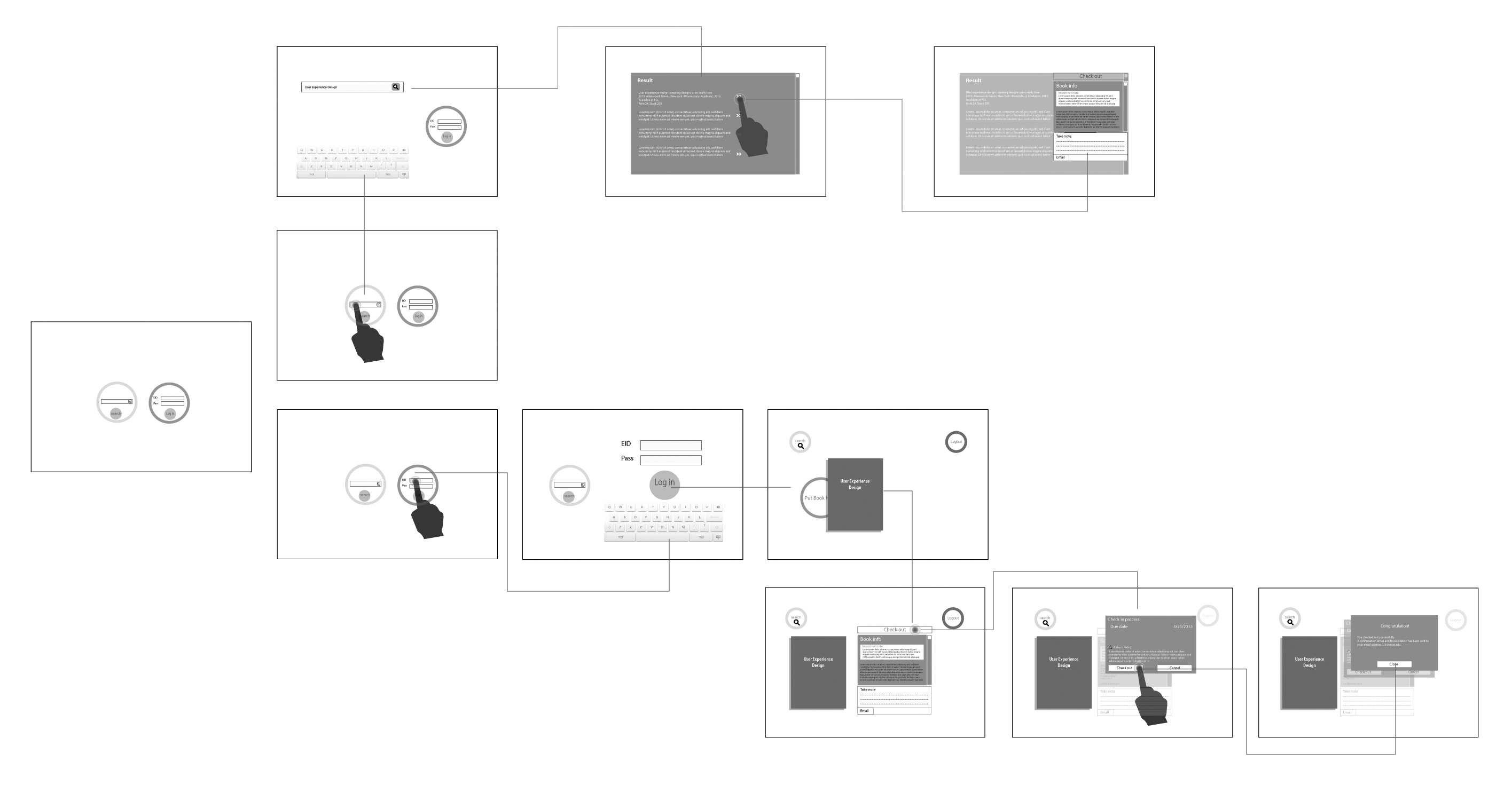
Through whiteboarding techniques, all the team collaborated in the ideation phase. The first idea and sketches attempted to facilitate preliminarily users’ need to have a pleasant experience in a way that encouraged them to use this application again and recommend it to their friends, although these two latter were to be confirmed by users and usability testing, however, we considered them in the first step of design. Therefore, simplicity was our most important criteria and we tried to make the application as intuitive as possible as many of our users are new students and aren’t familiar with the check out process. The sketches below illustrate our first thoughts and drafts.
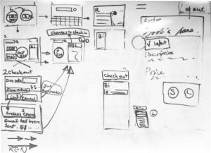
Then, the next step was a small modification inside the group critique. Then a quick first UI was designed for user testing as a low-fi prototype according to the sketches. In the usability test, we applied the Wizard of Oz technique and asked five people to attempt specific tasks.
User Test
Wizard of Oz
In the field of human-computer interaction, a Wizard of Oz experiment is a research experiment in which subjects interact with a computer system that subjects believe to be autonomous, but which is actually being operated or partially operated by an unseen human being.
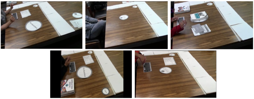
After finishing our initial prototype and setting up interactive rules, we use several pieces of paper and a physical table to conduct the first round usability test based on the process of a Wizard of Oz experiment.
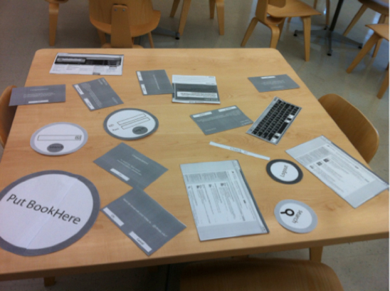
During the experiment, we randomly invited five students studying in a university’s library as the participants of the usability test. Two of them are males and all of them are undergraduate or graduate students. The academic background of them varied.
User Test Result
With the Wizard of Oz, we found a number of problems in our system and three major ones are listed as below:
Terminology
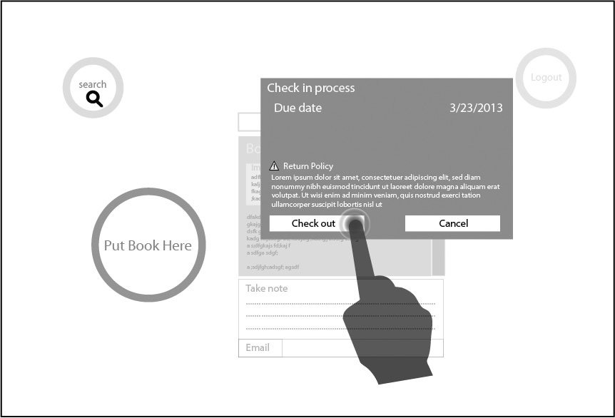
For example, after the participants logged into the system, there was a large circle on the table, which surrounded a few words: Put Book Here. During the experiment, there were two participants that failed at this point: one moved the book on the air over the circle and tried to “scan” the book without directly touching the screen of the table. The other did not understand at all, totally ignoring the existence of the circle and trying to look for ways to go online on the screen.
Mental Model
People have their own mental models. While the participants took notes on a specific book with the table, two of them did not click the “Email” button, which means their notes were not saved properly. At this point, they explained that they thought their notes would be saved “automatically”, whereas our system didn’t do so.
Borrowing Process
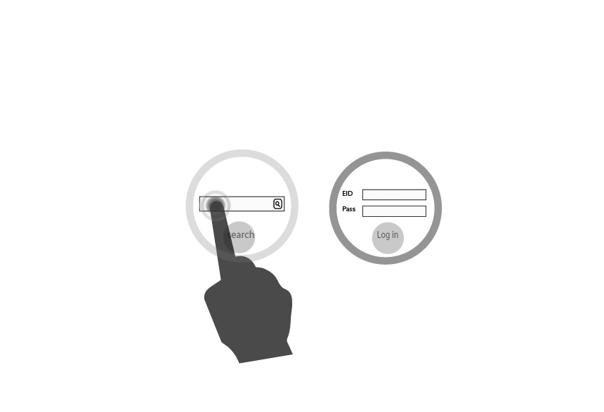
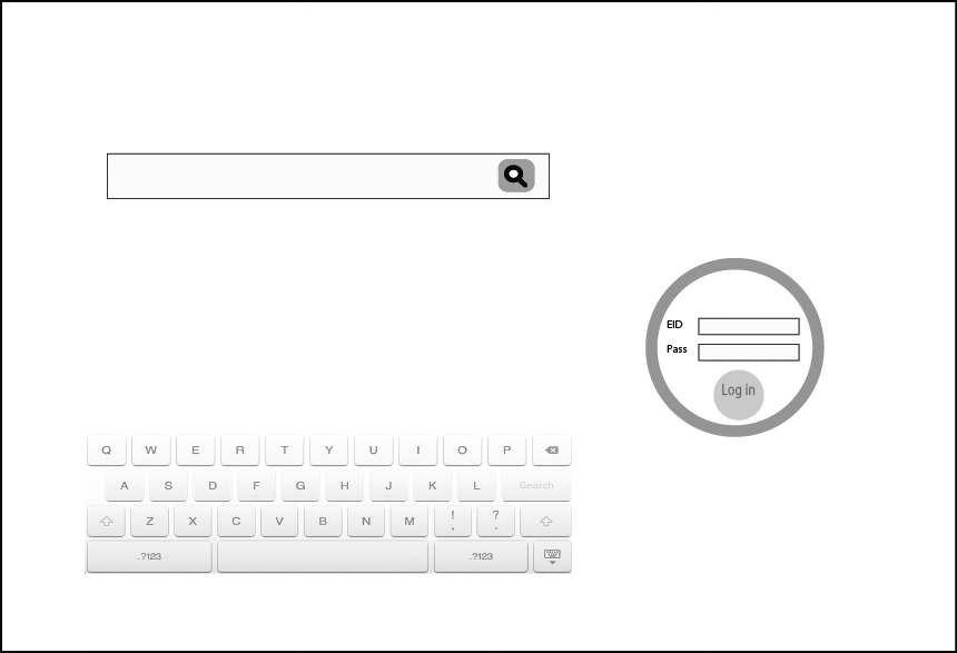
In our initial design, the users of the system were asked to login to the system at the very beginning. However, most of the steps in the process of borrowing a book are unnecessary with a UT EID, searching books and taking notes are two typical examples.
Based on the observation and responses from the participants in the Wizard Oz experiment, we made conclusions as the guidance of further redesign:
- The expression used in the system should be accurate and easily understood.
- To prevent the users from making mistakes, the design should fit the mental model of them.
- Not requiring the users to do unnecessary steps for a given task, Make the steps of each task in the system as few as possible. in the system as less as possible.
Hi-fi Prototype & Modification
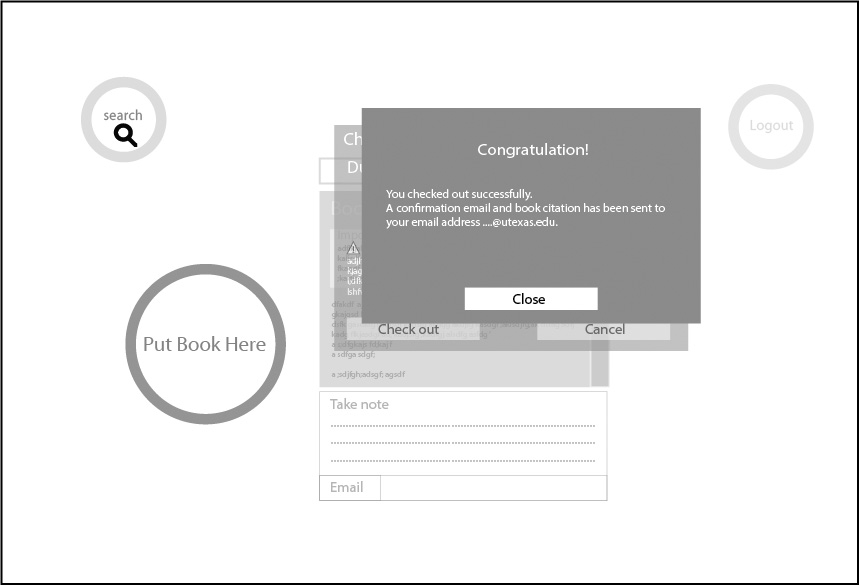
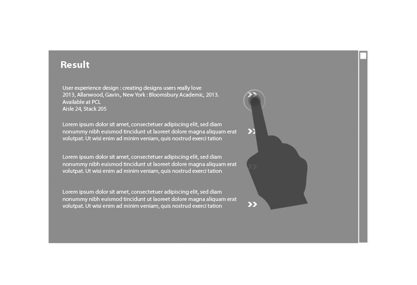
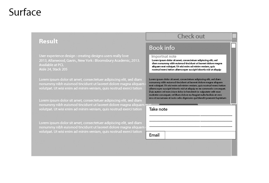
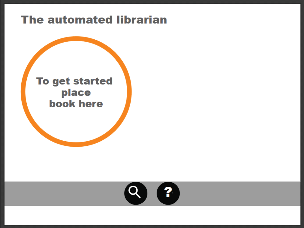
We redesigned the system based on the problems found in the testing and conducted the next round of usability testing. In this part “Visual Studio Blend Sketchflow” was used to design a hi-fi prototype for having a more realistic version of our app and genuine user test. By using this software we were able to upload our second iteration on the surface table and have a real test. According to the first usability test and users feedback, we changed all windows to pop up to help and instruct users to use the app without any confusion. By doing this, users had to go through the app step by step to accomplish a certain task. We also changed some terminology like “check out” to “borrow” and instead of “put book here” we used “to get started place book here”. In addition, we eliminated the “check in” feature from the app.
Second User Test
For the second user test, we asked four people to participate with the high fidelity prototype. In this test we let users explore the application according to the specific task we defined for them, and then we asked the following questions:
1- What was the most difficult task to accomplish and why?
2- If you could make changes to this system, what changes would you make?
One user had a little confusion over the “take notes” task, but others perceived the whole task clearly and understandably in order to perform.
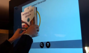
And for the second question users suggested the following options:
- Add textual suggestion along with “borrow” and “take notes” icons
- Providing map for books’ place
- Providing more information about each book
- and using fewer prompt windows
Implementation & hardware
Device
To implement the prototype of the first two rounds of usability testing, a device fitting several fundamental requirements as below was needed:
- The table can run applications and is multi-touchable so as to let users manipulate it;
- The surface of the table can sense the information of physical books;
- The table can access the Internet so as to verify the identity of the users;
- The size of the table should be large enough to put at least one book on it and to have enough space to present the information of the book and to manipulate it. To fit the requirements, we chose Microsoft
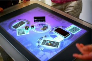
PixelSense as the device to implement the functional features of the system. Microsoft PixelSense, a device that was formerly named Microsoft Surface, is an interactive computing platform that allows one or more people to use touch and real world objects, and share digital content at the same time. The PixelSense platform consists of software and hardware products that combine vision based multitouch PC hardware, 360-degree multiuser application design, and Windows software to create a natural user interface (NUI).
Core Technologies
The most difficult part in the implementation of the system was the recognition of the books. To resolve the problem, we used the featured function of the Microsoft Surface application: Tagged Object Recognition.

According to the introduction on the website of Microsoft Surface SDK, tagged objects provide many new scenarios for Microsoft Surface applications. Each tag that the Surface system identifies has an orientation and a 64-bit property that holds a tag value. Currently, a device made for Surface can recognize and respond to values between 0 and 255.
After direct touch between the tags and the screen of PixelSense, the tag-driven application running on the PixelSense could sense the different value of the tags immediately.
Discussion and Conclusions
In this project, we explored potential applications for a walk-up-and-use multitouch table for the Perry Castaneda Library (PCL) at the University of Texas. The prototypes simulated API access to the University of Texas student Electronic Identification (EID) system and the library database through a fiducial located on the back of the book that would be required for core features to fully function. Users also tested the interfaces in lab-like settings rather than the actual library settings where a finished system would go. Simulating these elements allowed us to concentrate our software development and user testing on the core features of our research.
Next Step
This project could have been considered a formative study to determine the direction of future multi-touch research for university libraries. The deadline for this project was tight and during the project, we only were able to develop main features for this Microsoft Surface application. Further research and usability test are required to find out whether this application will increase user experience and library productivity.
However, with the increasing number of smartphone users it seems the Samsung SUR40 table did not seem to be an appropriate interface for standard library tasks alone, but it had potential as additional features for more appropriate uses such as social and multimedia engagement, group work, and cross-medium interactions such as copying physical images and text to a document processor.
